Design Tokens and Theming

As frontend developers we are normally given a design from Figma or similar tools that we then need to turn into code. So where do we start? What are the first steps we should take when converting our design into code?
if you are lucky to work directly with the designers then this is great, but of course sometimes designs come in from an agency and there is not much room for communication with designers, which is a pity. So if you do work directly with your designers how should you proceed?
With Figma designers can design components as symbols, which can then be reused across their designs. They know what components they have previously designed and used and what components need to be designed from scratch. Designers should also have a design system where they use design tokens so that their designs are consistent, using the same color palette or same spacing for example.
But as developers were are just given a completed design that we must then convert into code. We might be tempted to just start building. We have a deadline after all so the sooner we start the better. But if it is a large scale project we might end up with some bigger problems later on that are much harder to solve. But what if we could work much closer to the designers? What if we could use their design tokens and create our design system with those tokens! Bridging the gap between designers and developers is key.
So lets talk design systems
Designers create design tokens for various things such as colors, margins, borders etc. These design tokens can then be exported from Figma or similar tools as JSON objects and used in a theme component that can be then applied to our components. That way everything can be then styled, using CSS in JS or CSS vars, and all our components are ready to accept new tokens or be used with different modes or themes.
In this example I have created a base theme component that takes all these design token JSON files and merges them together using Object.assign. By creating them as separate files I can then showcase them all individually. Adding a new design token to the primary colors for example will auto render the token so that the developer can easily see the new color and value.
export const baseTheme: Partial<ThemeSchema> = Object.assign(
  tokens,
  fontFamilyTokens,
  fontSizeTokens,
  fontWeightTokens,
  primaryColorTokens,
  secondaryColorTokens,
  errorColorTokens,
  borderRadiusTokens,
  borderSizeTokens,
  textColorTokens,
  backgroundColorTokens,
  boxShadowTokens,
  generalColorTokens,
  headingsSizeTokens
)
I did this by creating a design token viewer component that takes the design token and renders it showing the name and value as well as the CSS variable name. I then created a composition for each design token using the design token viewer component.
<DesignTokensViewer
  tokens={borderSizeTokens}
  additionalStyles={{ border: 'solid black' }}
  cssKey={'border-width'}
/>
There is of course still a missing connection between the designer and the developer in that if they make a change to the design tokens or add a new one there is manual work involved in then updating the theme component files. Although there are some tools that seem to have this feature I have not personally been able to find a good solution with the tools I am working with. What we tend to do here is give the ownership of the theme component to the designer meaning they can update and add design tokens whenever they need to.
Allowing the designer to own the theme component makes it easier for them to really keep the design system alive and current modifying token values and adding new ones and developers just have to use the theme component to get all these changes and can always see the rendered design tokens that are available to them.
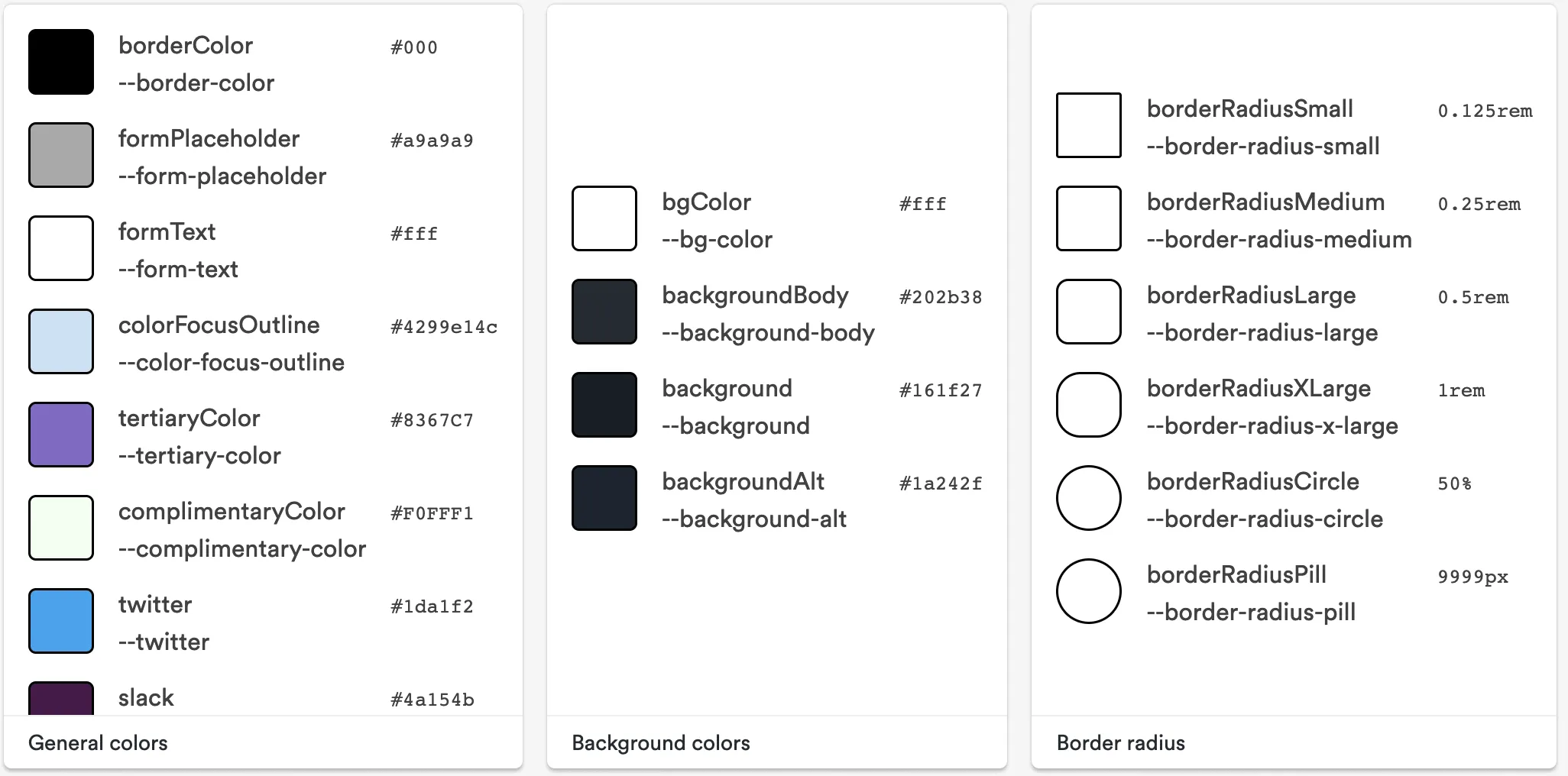
The Base Theme Component
The base theme is a component that contains all the design tokens and values for the base theme which can be overridden by any other theme. A theme schema can be created if using typescript. This will ensure our values are correct and using the right type.
Design tokens should be sorted into CSS properties as this makes it easier to view them with the design token viewer. This means we would have a design token file for primary colors, font families, font sizes etc.
Theme Providers
in order to use the base theme component in React we need to create a theme provider. This will allow us to provide the theme to all components that are wrapped inside it. The theme provider must be able to read the design tokens and convert them into CSS variables so the design tokens can be used by the component in either CSS in JS or as CSS vars either inline or in a separate stylesheet.
In order to make sure the design tokes are converted to CSS vars I will use the createTheme function from teambits Theme Provider component. This component manages the converting to CSS vars for me. Feel free to read up more on how it works.
import { createTheme } from '@teambit/base-react.theme.theme-provider'
Then we just need to create our theme and use our provider. This complete version of the Theme Provider Context component I created also leverages the context to be able to add theme togglers for changing to dark and light mode or other themes. I won't dive into this in this post so below is just a basic example of how the theme can handle a theme override.
<BaseTheme.ThemeProvider overrides={customTheme}>
  {children}
</BaseTheme.ThemeProvider>
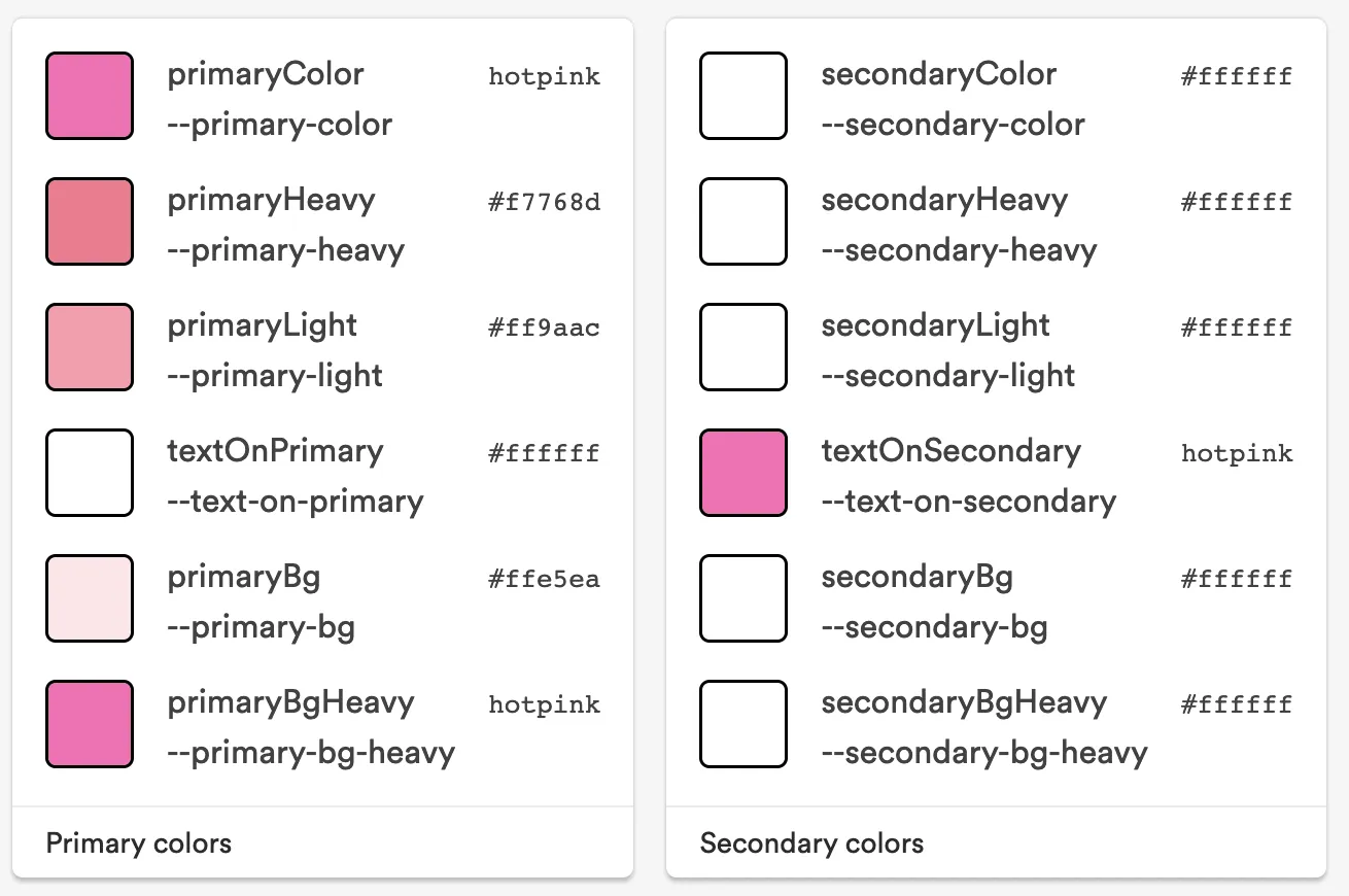
The Pink Theme
The Theme provider comes with an overrides property so that we can add in any theme and it will merge with our base theme and override any duplicated design tokens. This means we can create a pink theme where only the colors change. However if we wanted to also change the font families then we would just add a design tokens file for font families inside our pink theme component.
Build Components or Build your Design System?
We have just built our theming and design tokens so now it's time to build some components. Some people start with a component library or enhance the design system and start building all the components that would make up this design system such as buttons, inputs, cards etc. if you have time to do this and a team dedicated to it then this is great but most people don't, so building the design system as they go along is also a valid option.
Naming your Components
We haven't started with the task at hand yet so lets do that. Again lets talk to our designers and make sure we are on the same page when it comes to naming.
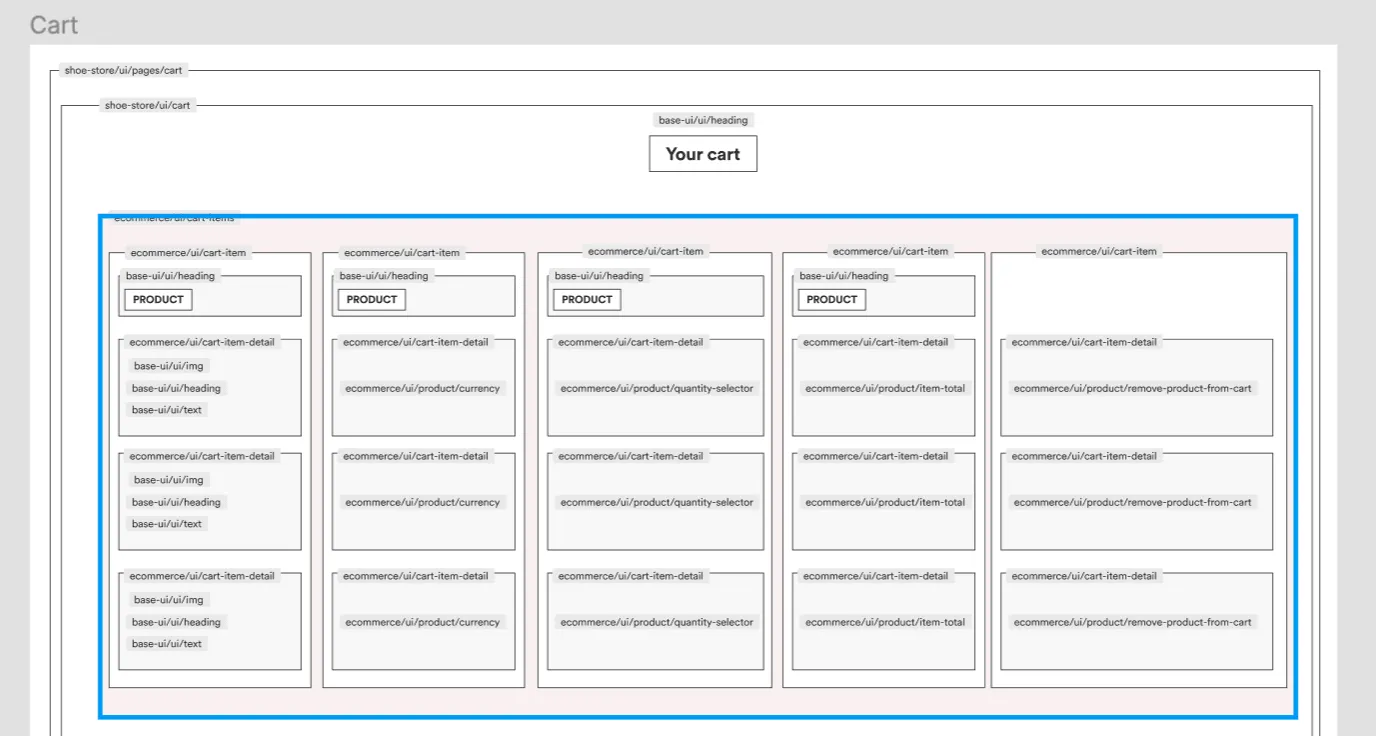
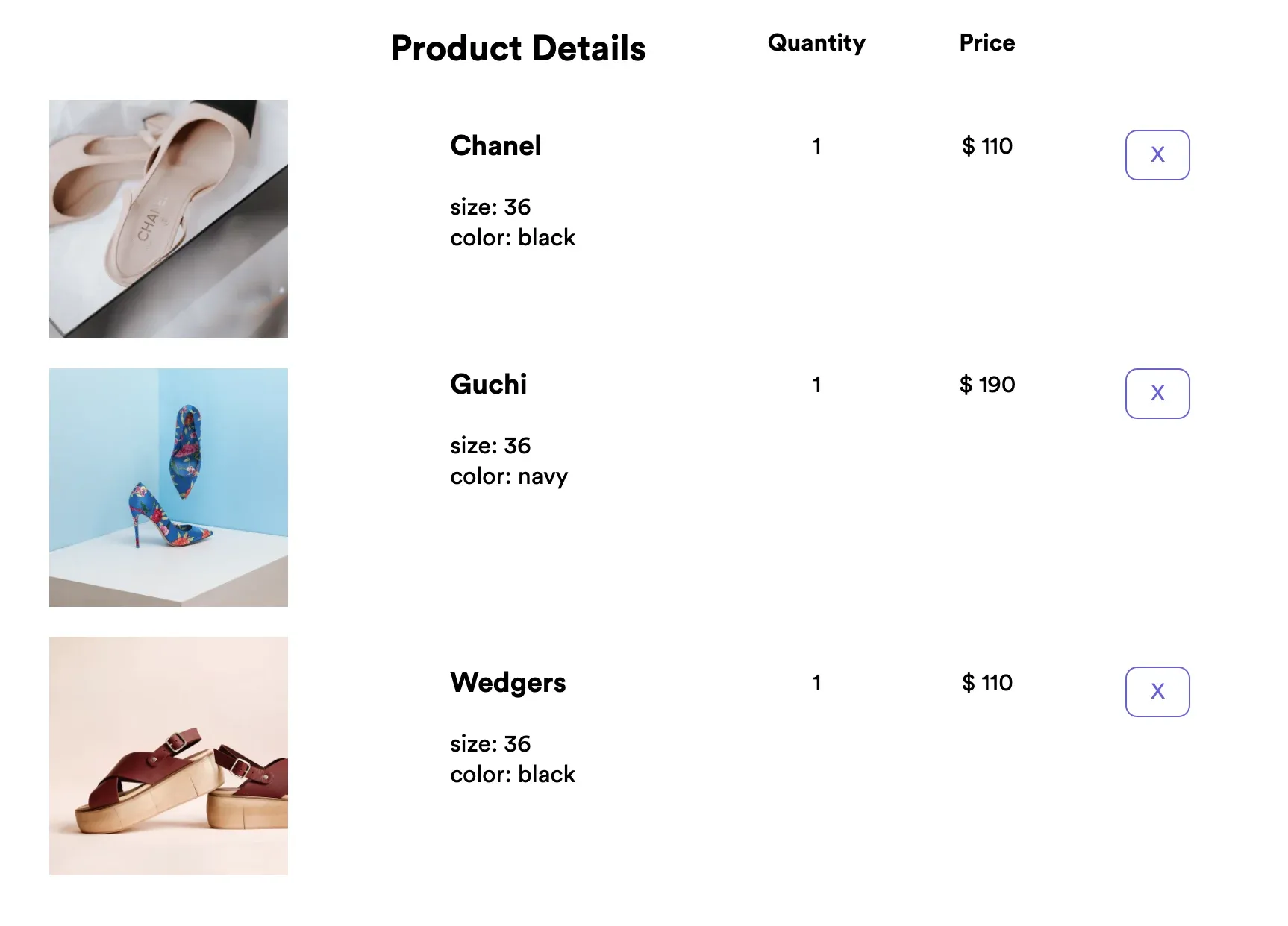
When building out the wire frames it is a good idea to sit down with the designer and think about the components that are being designed. We start with a page component called cart and we even think about where this component lives, in which folder or in which scope or to which team it belongs to. The cart component contains the heading component, which is a base-ui component that will be used throughout the site.
We can use the wire frame to add naming to our components. That way when the designer goes to build the design they will use the names that are on this wire frame and the developers will also use these names. Components in Figma should also have the same folder structure and ownership as those the developer uses. This also means if new designers or developers are on-boarded it is much easier for them to find things especially developers who need to see both designs and available components.
Listing out our Components
With a design it can sometimes be hard to see the breakdown of components but with a wire frame it is much easier. We can then convert this wire frame into a list of components that we need to create.
- cart page
- cart
- heading
- cart items
- image
- text
- currency
- button
- remove from cart
If we already had a component library created we could then add a tick next to the components that we already posses and work on creating the ones we don't. As we have no component library created we can now start thinking about the API for each component.
Component API's
We want our components to be used throughout our app and consumed by various developers. But we don't want to over architect our component either so we need to think about what we need for this component to work and how it should be best implemented.
We can also think about every use case there is and start building that into our component but sometime this isn't the best idea and we may end up with a component that does way too many things and it is extremely hard to take functionality away once a component has been adopted. It is much easier to later add some functionality if and when it is needed.
Our heading component should contain an element prop which allows the consumer to choose between h1, h2, h3 etc. An image component should have an alt prop, a src prop and perhaps a loading prop for lazy loading options. A text component could contain an element prop to render a p tag or a span tag.
A button component should be a basic button component that may accept props for adding styles so as to have primary or secondary buttons for example. It should also allow an onClick prop so it can be used in different circumstances.
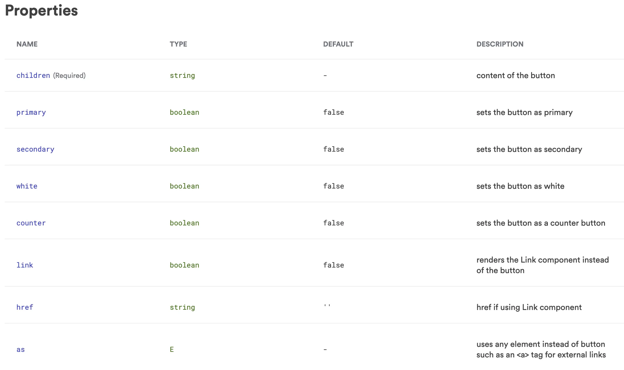
A remove from cart component should have the functionality of removing a component from a cart and include the button component. This means consistency will be kept across all apps as the button component which contains the styling is used inside these wrapper components that add the functionality needed.
export type RemoveShoeFromCartProps = {
  /**
   * item in cart
   */
  cartItem: Shoe
}

export function RemoveShoeFromCart({ cartItem }: RemoveShoeFromCartProps) {
  const context = useContext(ShoeCartContext)
  return (
    <Button
      className={styles.removeFromCart}
      secondary
      onClick={() => context.removeProductFromCart(cartItem)}
      aria-label="Remove from Cart">
      X
    </Button>
  )
}
Creating our components
Once we have defined everything we can then go ahead and start creating our components. I would suggest starting with the biggest component, the page component in this case. As we are building the page component we can simply add html elements and placeholders for each component. Basically like building the wire frame inside your page component.
In order to make sure my component stays true to the design I like to import the Figma file right into my component docs. That way I can see the design against my composition to see if it is correct. It also makes it easier for me and any other developer to easily open the Figma file for that component without having to search through Figma. And as it is a Figma embed any changes to the Figma file or updated live in my component docs making it also easier for designers and product managers to make sure changes have been implemented.
I have done this by creating a Figma Embed component and adding it to the doc file of my component.

We can then go ahead and start building the next biggest component that the cart page component needs. In our case it is the cart component that contains all the elements of the cart. You may ask why we should even create this as a component and instead just render it in the page component?
The reason is that the cart component, containing all the items of the cart, might also be used in other areas of your app for example when hovering over the cart icon or in a collapsible sidebar when browsing the site. Making it a component means it can easily be added to any other place on your site and if it is an independent deployable component it can be used on any other e-commerce site.
Continuing on with our components the next one is the heading component so we start building that working with the API we have defined to allow different heading elements to be passed in. We then import that component into our page component adding the element of h1. And we continue with this process until our cart page is complete.
Working as a Team
If there is more than one person working on building out this page then there is no issues at all as each component is built separately and then imported into the cart page. What is important is deciding on who is doing what so that no duplication happens and also making sure there is a central place for viewing components that have already been created and that these components are easy to find.
Document and Test your Components
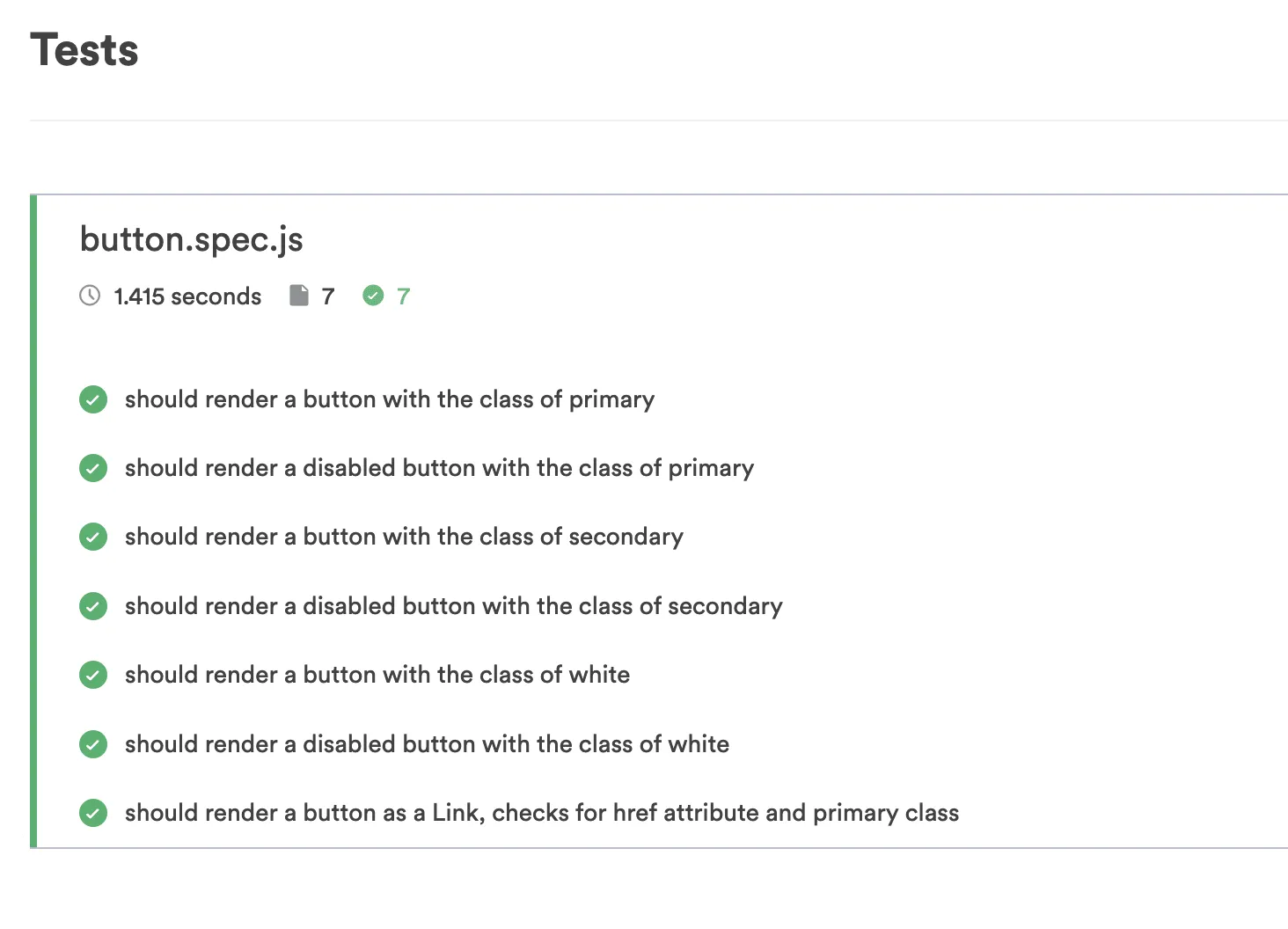
More importantly making sure your components are easy to use and understand with great documentation and examples is key if you want your components to be adopted by other developers. Creating compositions of your component with different use cases will help developers see how it can be used and writing tests for these components is extremely important so developers can really trust your components.
Conclusion
Taking the time to think about what you are building will really save you a lot of time in the long run. Maybe you don't need a different theme now but you perhaps will in the future. If we build our components with scaling in mind it really will be easier to scale. Design Tokens help us do that.
Using CSS vars is a great way of making sure your components can be themed. But it's not just theming. Sometimes the design changes. Designers might re-write design token values and if they do it should be just a matter of updating those values in your design tokens files in your theme and your components will then receive these new values without having to do any modifications to the components themselves.
I hope you enjoyed the post. Good luck and have fun and reach out to me if you have any questions at all.
